How to Create a Histogram in Excel
Looking to create a histogram in Excel? Check out this step-by-step guide to see how it’s done.

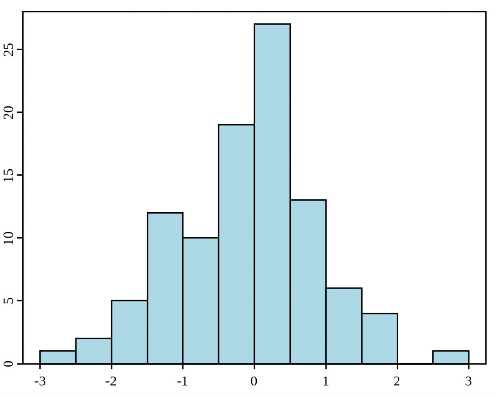
A histogram is a graphical representation of data that shows how often each value occurs. To create a histogram in Excel, you need to have a data set that is already organized by frequency. You can then use the Histogram tool to create your histogram.
What is a Histogram?
A histogram is a visual representation of a data set’s numerical distribution. Histograms put a range of values into a bin or bucket by dividing the entire range into intervals and counting how many values fall into each interval.
Histograms were first introduced by Karl Pearson, an English mathematician, statistician, and key person in the grounding of the school of biometrics.
How to Create a Histogram in Excel
To create a Histogram in Excel:
- Open your data set in Excel, and highlight the range of values for which you want to create a Histogram.
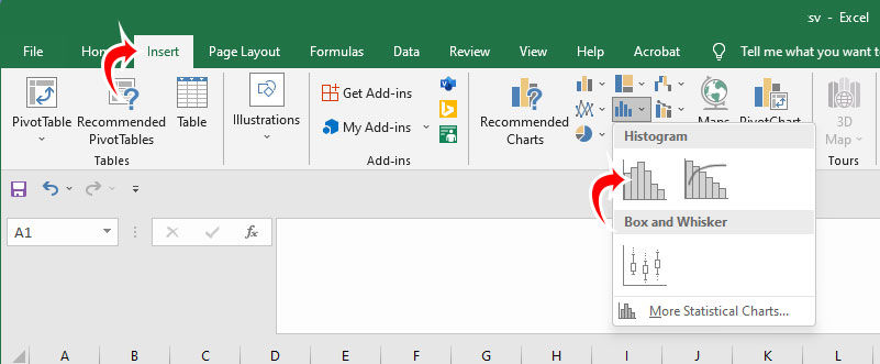
- Go to the Insert section from the top menu and select Histogram.
Excel will automatically format a Histogram based on the range of data you selected. There are likely some additional tweaks you will want to do to get your Histogram how you want it, though. First, you probably want to adjust the intervals on the X-axis.
To adjust the Histogram’s intervals in Excel, click on an interval and press Ctrl+1 to bring up the Format Axis options. Edit the Bin width to set the interval manually. You can also check the Overflow and Underflow bin and set it to a whole number to clean up your change if there are decimals.